45
18
Including some disturbing news for America.
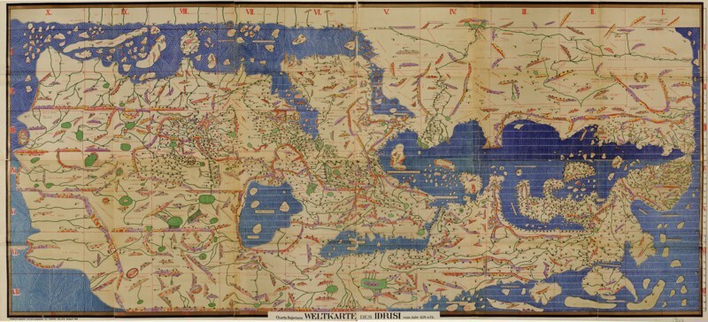
A map of the world from 1154.

Drawn by the Arabic cartographer Mohammed Idrisi, from the Tabula Rogeriana (Book of Roger).


A map of the world in 43 AD: a reprint of one drawn by Pomponius Mela, a Roman scholar credited as the father of geography.


Sticking with population: This is how big each country would be if it were in proportion with its population.


The Ortelius World Map (1564), the first map by Abraham Ortelius, creator of the first modern atlas.
, the first map by Abraham Ortelius, creator of the first modern atlas.")
The Theatrum Orbis Terrarum, published in 1570, was a collection of 53 maps.


Source:
Ссылки по теме:
- This Amazing Tree That Shows How Languages Are Connected Will Change The Way You See Our World
- Vintage Style Astronomy Maps Made from Open Source Data of the Universe
- Bloodwood Tree
- Map Reveals How Long It Takes To Learn Different Languages
- Meet The Cutest Animal You’ve Never Heard Of


