16
16
Architecture, like all arts, is one that has its masterpieces and its unloved failures. But this list is not about those great ideas or any of those debated theories. No, in this series of 15 buildings which span the globe, we’ll show you some of the ideas that should have been rejected, the worst of the worst. Idiotic ideas. Outrageous designs. The foolish, the weird, and the downright ugly

15. Malaysia’s First World Hotel

The bombastic, tragic color scheme of the Malaysia’s First World Hotel doesn’t, in fact, conceal a beautiful, redeeming interior. The rooms are small and bland and the hotel itself is little more than a place to stay while you gamble or visit the rather underwhelming theme park. It’s like the saddest parts of Vegas getting slapped with a faded rainbow. Probably the most disappointing part of this awful architecture is that it is a giant eyesore on an otherwise fantastic location—it’s on the top of a mountain in the middle of the Malaysian jungle. Something inspiring and majestic could have been built here. Instead we wound up with this.
14. Jaiyi County Church

This, believe it or not, is a church in Taiwan. In a bid to get more female parishioners, the designers apparently thought a nice high heel would be just the thing. Not only does this not look like a church, it doesn’t even look like a building—it’s more of an awkward sculpture than a house of worship. But apparently women love their heels so much that of course they’d be drawn to this building, like moths to flame. Perhaps the only thing worse than bad architecture is bad, sexist architecture.
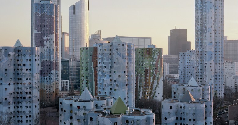
13. The Tours Aillaud

The Tours Aillaud, located just outside of Paris, France, is such a presumptuous, imposing collection of towers that architect Émile Aillaud decided to stick his name on the front. Unfortunately, his vision for the future of housing hasn’t done his name all that well. The towers looked weird to many when they first showed up—that paint scheme which makes them look like partially denuded crayons is, in fact, on purpose. And now that we’ve passed through the wild-eyed futurism of the 70s, these towers appear to be an overly curved, vast mistake. Sometimes ideas are ahead of their time; sometimes they never had a time to begin with.
12. The Fang Yuan Building

The Fang Yuan Building in Shen Yang, China, decided that instead of trying to look like a building, it would look like a giant coin. There are probably a lot of clever jokes being told about how much money these 25 floors of offices make and no doubt those all-glass sides make for some spectacular views of the surrounding city. But the result for everyone else is nothing short of an oddity. Why CY Lee, the architect behind the majestic Taipei 101 building, decided to go with such a kooky design we may never know. But it’s clear that trying to make your skyscraper look like anything that fits in your wallet is not the strongest design principle.
11. The Longaberger Company Headquarters

Out of the “I Can’t Believe that’s not Photoshopped” file comes this head-scratcher from Newark, Ohio. This is the office of The Longaberger Company, which is, you guessed it, a woven basket company. In a show of solidarity with their customers, they decided to house themselves in a giant-sized version of one of their own products. There aren’t exactly any good architecture principles on display here, but if you can ignore how silly it is you can almost admire the dedication to their product. Some companies buy billboards. Longaberger made a whole damn building to advertise.
10. The Villa Faberge

This horror show out of Newport Beach, California, gets a special place on our list for being an example of perhaps the worst thing you can possibly do when you have the money to build a gigantic mansion for millions of dollars. A confusing mishmash of odd choices that attempt to invoke gilded age refinement, every room in this disaster ends up being a nausea-inducing box of terrors, like a kaleidoscope of crap. It’s as if a separate interior designer were hired for each room and given the express instruction to fill it with as much obnoxious junk as possible. If its stupendous tackiness doesn’t offend you, the $15 million asking price should.
9. The De Vere Grand Harbour Hotel

The De Vere Grand Harbour Hotel, in Southampton, England, looks like the unfortunate love child of a run-down apartment complex and a pyramid. It falls prey to the most classic of architectural blunders: lack of direction. Which exactly does it want to be? While the exterior is a confusing mess of angles and terraces, and beholden to an unfortunate brown color scheme, reviews have also indicated that the insides aren’t much better. This was a dumpy design someone tried to spruce up with a bold glass entryway, but sometimes a compromise is just the worst of both worlds.
8. MIT’s Strata Center

Frank Gehry is a polarizing figure in architecture. Some find his designs needlessly unorthodox and over the top while others bask in their audacity. Whichever view you take, he is no doubt one of the biggest living stars in architecture. Occasionally though, those lofty ambitions can outstrip good sense. This frightening fellow is MIT’s Strata Center in Cambridge, Massachusetts, which houses both computer science labs and the philosophy department. Getting around inside it is a bit like running a maze (no two parts are exactly alike) and some tenants have complained that its deliberately random design makes it confusing and unpleasant to work in. It demonstrates the danger of abandoning tradition: in trying to make something original, you may just end up with something nonsensical.
7. Freedom Cove

This collection of buildings isn’t actually an obscure theme park or an overzealous boutique hotel—it’s the home of two Florida residents with a big dream for living on the water. If the turquoise and pink paint scheme doesn’t give you the willies, its location—in the middle of nowhere, British Columbia—probably will. The dedication of the owners to create their own artificial island is cute, but it shows you what happens when you piecemeal a house together over decades: you wind up with a strange collection of vaguely connected barges that look half junk yard and half Disneyland. Beautiful island houses have been built before. This isn’t one of them.
6. 3121 Antelo Rd

Why would anyone put this in the middle of a perfectly average Bel Air mansion? We may never know, but why they kept it in the listing photos when they tried to sell the place is even more of a mystery. If the horror of the wallpaper doesn’t turn you off completely, its camouflaging effect, as it consumes the rest of the room’s furniture, probably will. When you’re selling your mansion, you should probably leave the photos of the crazy room off the internet. Unless you think Sparkle Princess is on the hunt for mansions. One hopes that by now this has been stripped and painted over.
5. 1010 HillDale Ave.

There is only one necessary takeaway from this home. No matter how rustic you think you are, you never go plaid. Never.
4. 74380 Palo Verde Drive

No, that’s not the inside of the new Chucky Cheese opening around the corner, that’s a house from Indian Wells, California that thinks it can sell itself for $11 million. Where to even begin with this one? The pink color scheme on everything? The gaudy neon lighting? The furniture that looks like it belongs in an 80s music video? There are so many sad choices to grab your attention here, you’ll have trouble focusing on just one. Remember when you got drunk and thought about turning your house into a second-rate Miami nightclub? No, of course you don’t because no one gets that drunk.
3. The Tianzi Hotel

The Tianzi Hotel, located in the Hebei province of China, is striking even if it is mostly an eyesore. You have to be a little impressed with the follow-through on such a crazy idea. Instead of building a regular hotel, why not build three giant gods and then have the guests live inside them? Yes, those are tiny windows you can see peeking out of the characters stitched into their robes. Unfortunately, the facade of these statues doesn’t seem to be holding up all that well, giving their jolly expressions a sad, soiled look. This is an example of what happens when “stunt architecture” goes wrong—while the building is in the Guinness Book of World Records, the neighbors are stuck with an ugly, preposterous mess that’s aging poorly.
2. Hotel Ryugyong

It’s more sad than ridiculous when you get to know its story, but this giant thumbtack sticking up out of an otherwise average cityscape is double-take worthy for its size and absurdity alone. Standing at 105 stories, it’s hugely out of scale with everything else, not to mention violently angular and bizarre-looking even from its most flattering angles. The story behind Hotel Ryugyong is that it’s also a testament to the ongoing failure that is North Korea. Located in the capital, Pyongyang, it’s been under construction since 1987 didn’t even have a finished exterior until 2011. It still has not opened. At the time it was supposed to be completed, it would have been the tallest hotel, but it seems it will be lucky if it ever ends up being a hotel at all.
1. Penn Station

New York’s Penn Station is inoffensively bad. It is bad in a mostly dull and acceptable way that might not bother you at a first glance. Which makes this a special entry on our list. Yes, the station is not spectacularly grotesque on its surface, but once you know its history and see what they tore down (the black & white photo) to make way for this dull, linoleum drudge, it’s almost too heartbreaking. Penn Station belongs on this list because it’s the perfect example of mediocrity gobbling up excellence. What’s newer is not always what’s better.
Source:
Ссылки по теме:
- The 14 Ugliest Buildings In The World
- Surreal Buildings Inspired By German Architecture
- 10 Buildings That Look Like Human Body Parts
- 17 Clever Buildings Whose Architects Refused To Cut Down Local Trees
- After Closing My Business I Can Finally Create Impossible Buildings


➨➨➨➨➨➨➨ www.incomefactory.orgfree.com